Visualizing Intersecting Sets
Understanding relationships between sets is an important analysis task. The major challenge in this context is the combinatorial explosion of the number of set intersections if the number of sets exceeds a trivial threshold. The most common set visualization approach – Venn Diagrams – doesn’t scale beyond three or four sets. UpSet, in contrast, is well suited for the quantitative analysis of data with more than three sets.
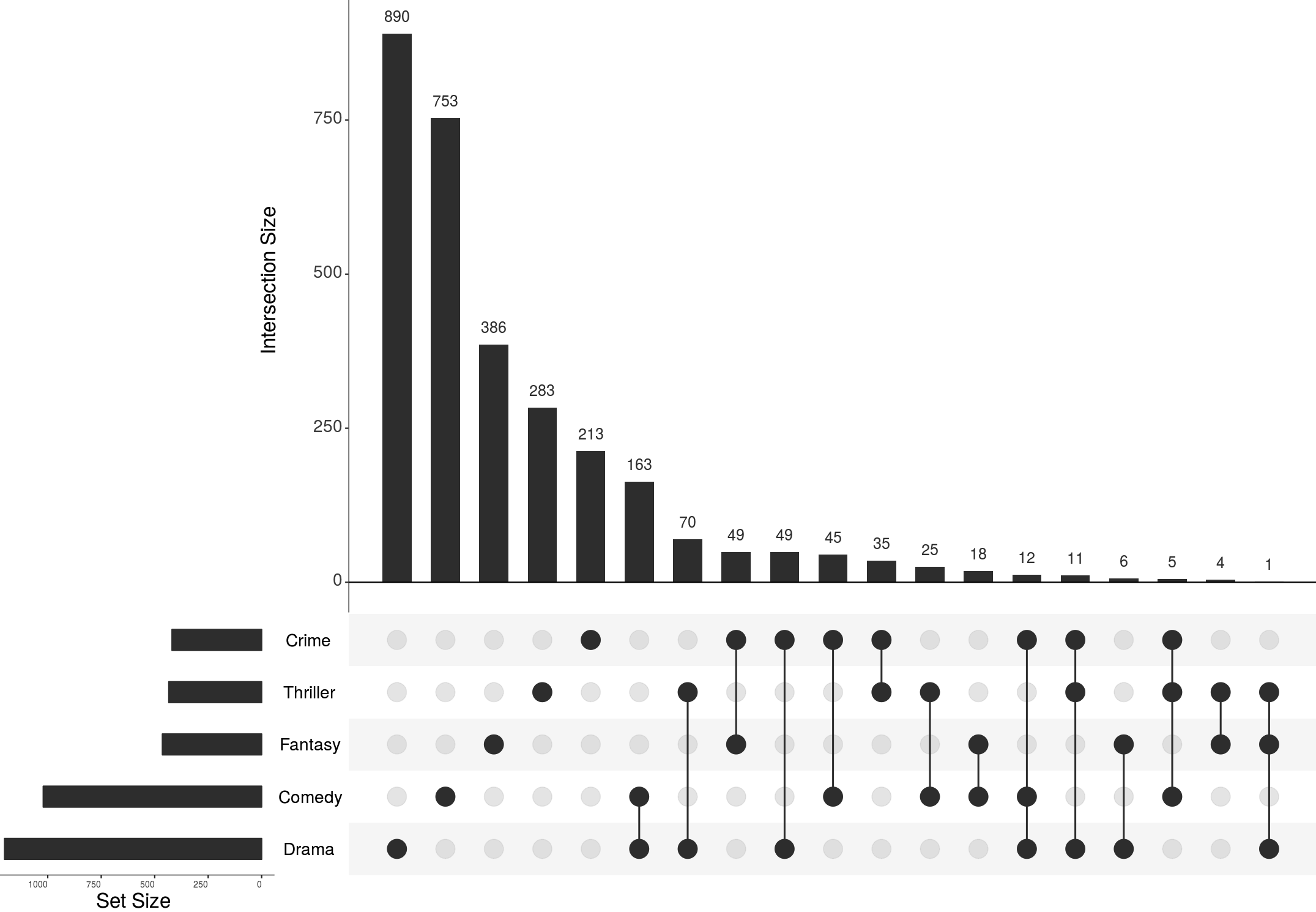
UpSet visualizes set intersections in a matrix layout. The matrix layout enables the effective representation of associated data, such as the number of elements in the intersections.
If you created an UpSet figure with UpSetR, please also cite the UpSetR paper:
When should you use UpSet?
UpSet works best for set data with more than three and less than about 30 sets. For fewer than 4 sets, an area-proportional Venn diagram might be the better choice, as they are immediately familiar to everyone.
UpSet is well suited for analyzing distributions and properties of many items. Items are abstracted away as “counts”, though attributes of the items can be visualized in integrated or adjacent plots. If you want to see individual items in your set, you should probably go with a Euler Diagram.
UpSet shines when you want to look at all combinations of how sets intersect.. If you want to look at pairwise intersections between sets, some sort of co-occurrence matrix might be a better choice.
Also take a look at the Nature Methods Points of View article discussing these trade-offs.
UpSet Explained
UpSet plots the intersections of a set as a matrix, as shown in the following figure. Each column corresponds to a set, and bar charts on top show the size of the set. Each row corresponds to a possible intersection: the filled-in cells show which set is part of an intersection. Also notice the lines connecting the filled-in cells: they show in which direction you should read the plot:
Here you can see examples of how these intersections correspond to the segments in a Venn diagram. The first row in the figure is completely empty – it corresponds to all the elements that are in none of the sets. The green (third) row corresponds to the elements that are only in set B, (not in A or C). The orange (fifth) row represents elements that are shared by sets A and B, but not with C. Finally, the last (violet) row represents the elements shared between all sets.
This layout is great because we can plot the size of the intersections (the “cardinality”) as bar charts right next to the matrix, as you can see in the following example:
This makes the size of intersections easy to compare.
The matrix is also very useful because it can be sorted in various ways. A common way is to sort by the cardinality (size), as shown in the following figure, but it’s also possible to sort by degree, or sets, or any other desired sorting.
Finally, UpSet works just as well horizontally or vertically. Vertical layouts are better for interactive UpSet plots that can be scrolled, while horizontal layouts are best for figures in papers.
These are the basics of UpSet! There’s a lot more than you can do with UpSet plots, such as visualize attributes of the intersections, or group intersections. Look at the advanced page for details.
Interpreting UpSet Plots
UpSet Plots are generally easy to read. There is one important caveat though: you should be careful about interpreting data where the size of the sets is very different. Look at the following example:
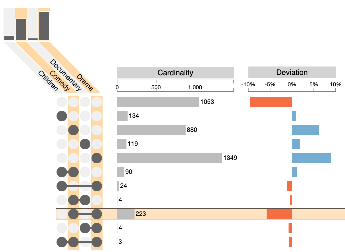
Here’ we’re looking at movie genres, and it looks like the 2-set combination of “Drama” and “Comedy” is the largest two-set intersection. While this is a correct observation it seems odd: dramas and comedy don’t seem to go together all that well. What we’re seeing here is an effect of the large size of the “Drama” and “Comedy” sets. Compared to the “Children“ and “Documentary” sets, those two sets are huge. To understand this, it’s important to also look at the set sizes, and hence no upset plot should omit the visualization of set sizes. The above example shows another metric that can be used to interpret this: the “Deviation” (orange and blue bars) that indicate how much an intersection deviates from the expected size if we assumed that set membership were random. We see that the comedy-drama intersection is actually much smaller than it should be if the data were random.
UpSet vs. Venn Diagrams
Venn diagrams are not suitable to visualize intersections of more than three or four sets. The figure below shows an example of a six-set venn diagram published in Nature that shows the relationship between the banana’s genome and the genome of five other species by visualizing which genes are shared between the plant species.
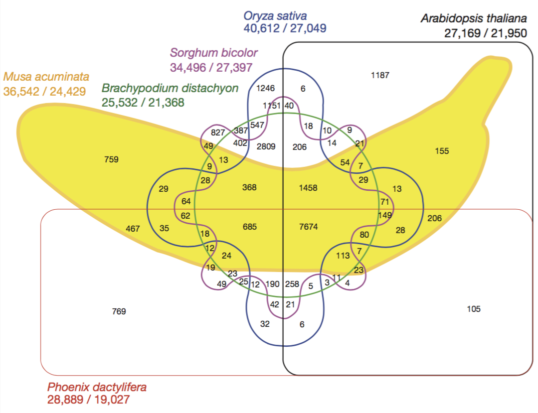
While this figure looks fun, it is not a useful visualization. Try to extract any information from it. It’s really hard to trace which intersection involves which sets. It’s not obvious which is the biggest intersection from the visualization – you have to read the labels one by one.
You might ask, how does the banana venn diagram look in UpSet? Here you go:
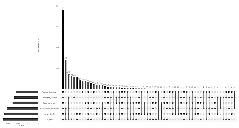
It is a little hard to read because the figure is rather small. But we can simply remove the small intersections, and we get a nice plot that shows us the main features of the data:
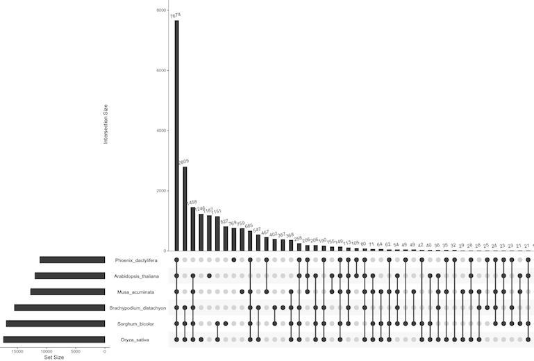
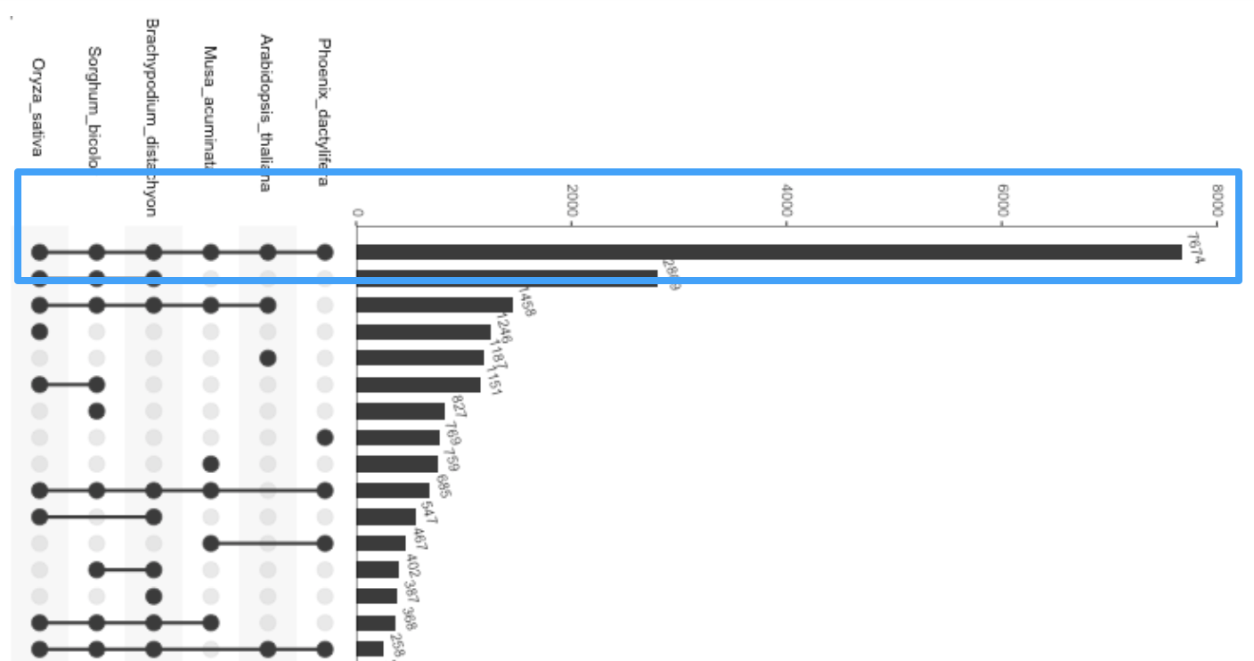
Notice how easy it is to see trends: the vast majority of genes is shared between all plants, as highlighted in the next figure:
Similarly, the first three species (Oryza_sativa, Sorghum_bicolor, and Brachypodium_distachyon) seem to be highly related, as all of them are part of the top-three intersections. In contrast, the sixth species (Phoenix dactylifera) seems to be most different from the others, as it only again is part of the sixth-largest intersection.
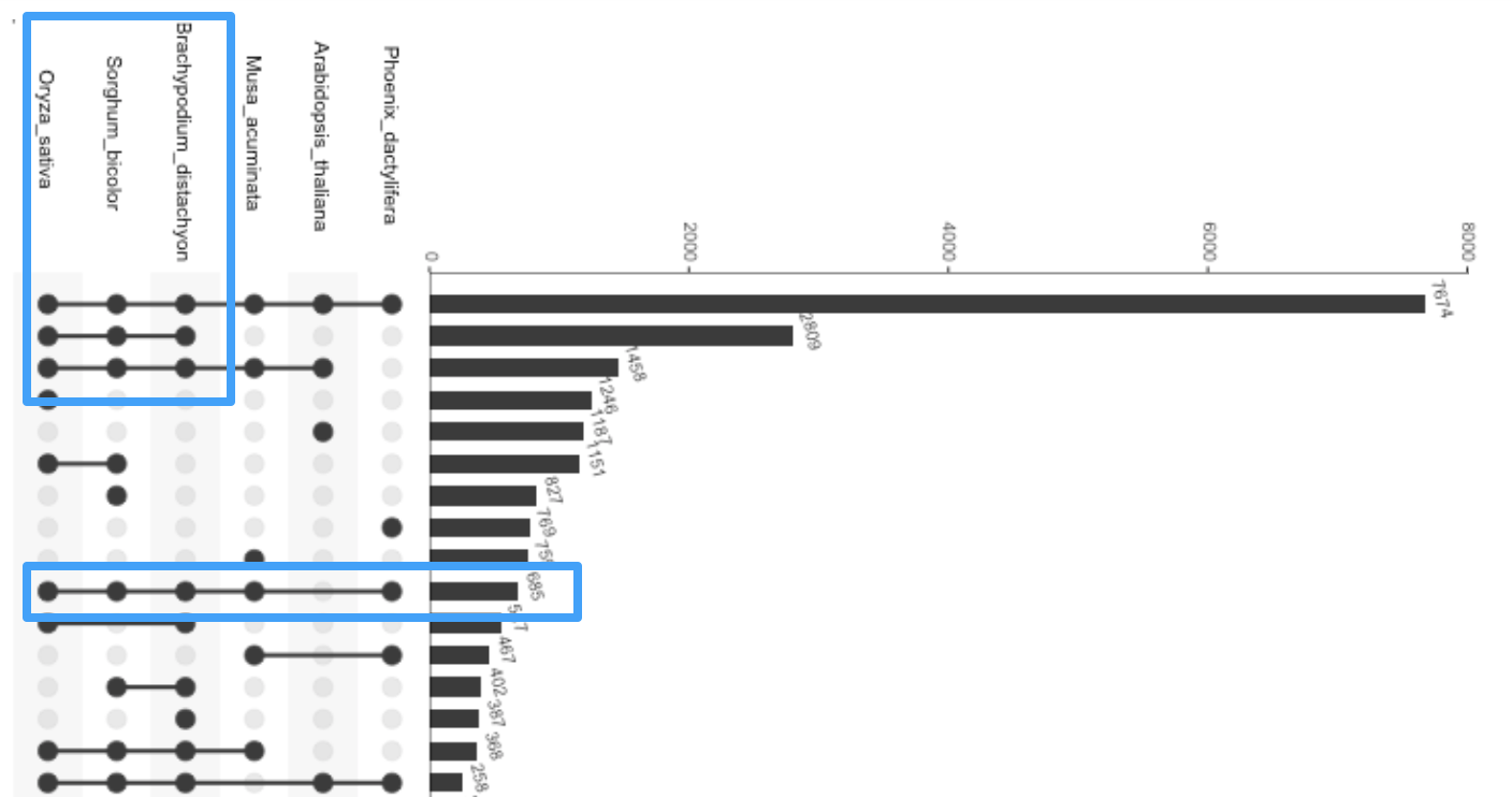
Such an analysis is almost impossible with a Venn diagram!
Frequently Asked Questions
-
How can I create high-resolution UpSet plots for a paper or other publication?
There are three options:
- If you prefer to use the interactive web-based version you can print an interactive UpSet plot to a PDF and edit the PDF with a vector editing software such as Adobe Illustrator.
- You can create an exportable figure to generate a plot using a programming language such as R or Python.
- You can create a static figure using, e.g., the R-Shiny versions of Upset.
To explore all of these options, please refer to the implementations page.
-
Can I show attributes of the intersections?
Yes, most implementations support visualizing attributes in some way.
-
Can I export the elements in a particular intersection?
Yes, but to our knowledge, only the interactive UpSet 2 version supports this.


